Selected work
Digital products with more room to look, read, and feel finished.
A collection of web products, experiments, and client work shaped around clarity, atmosphere, and practical usefulness.
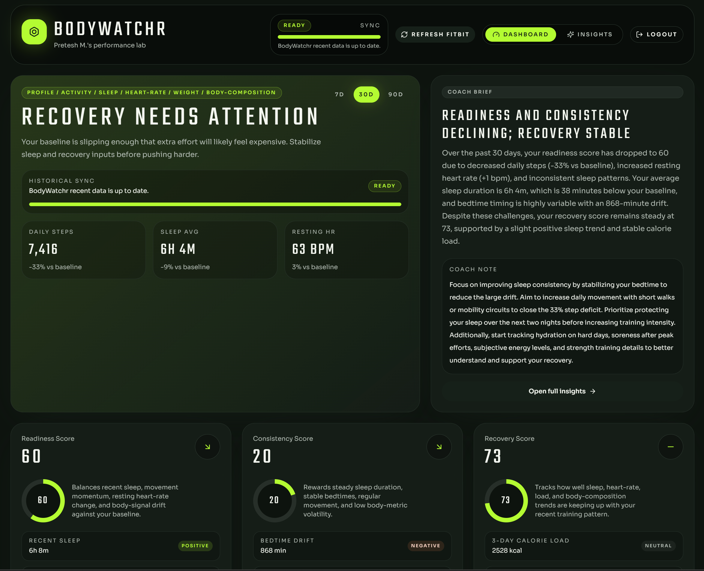
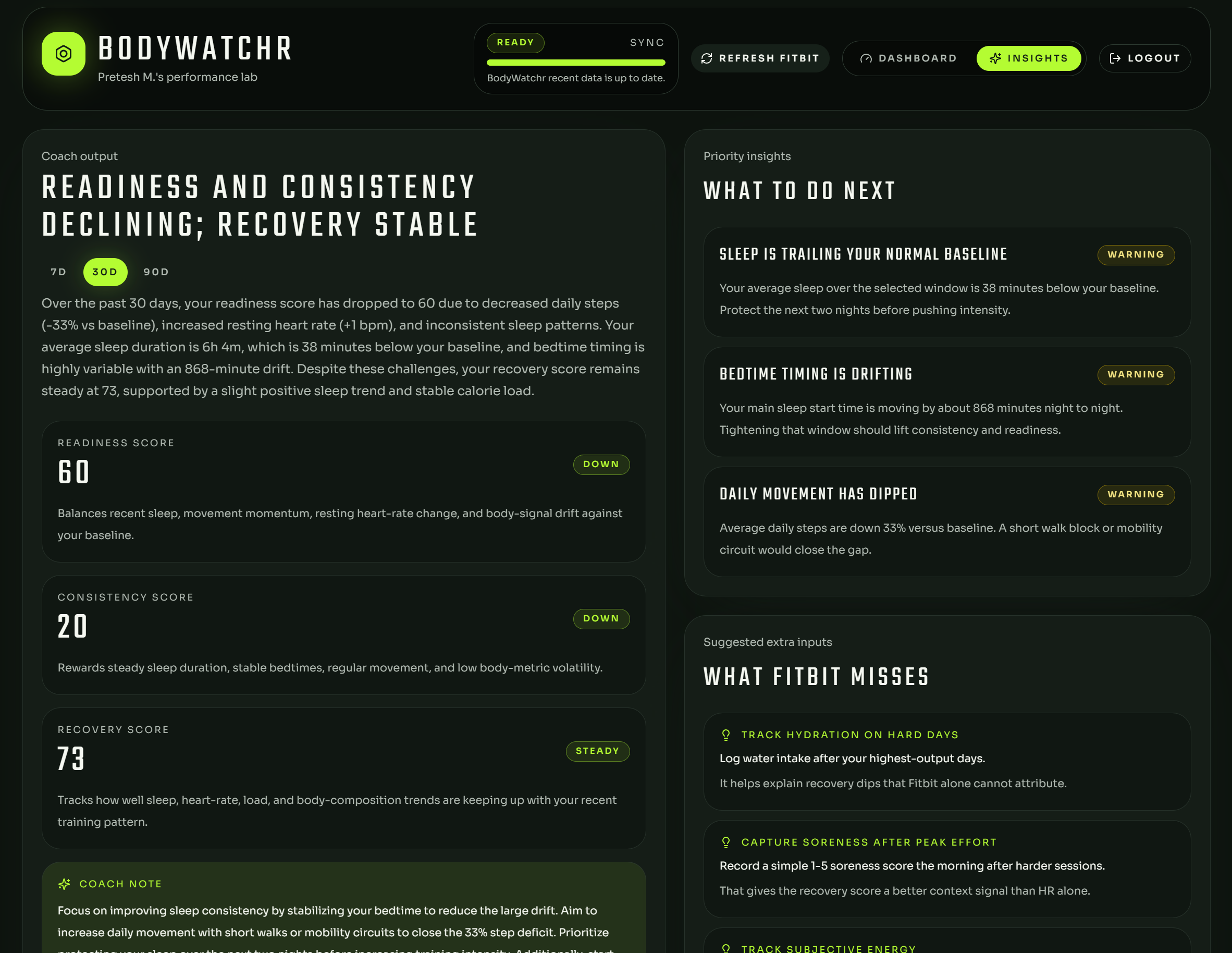
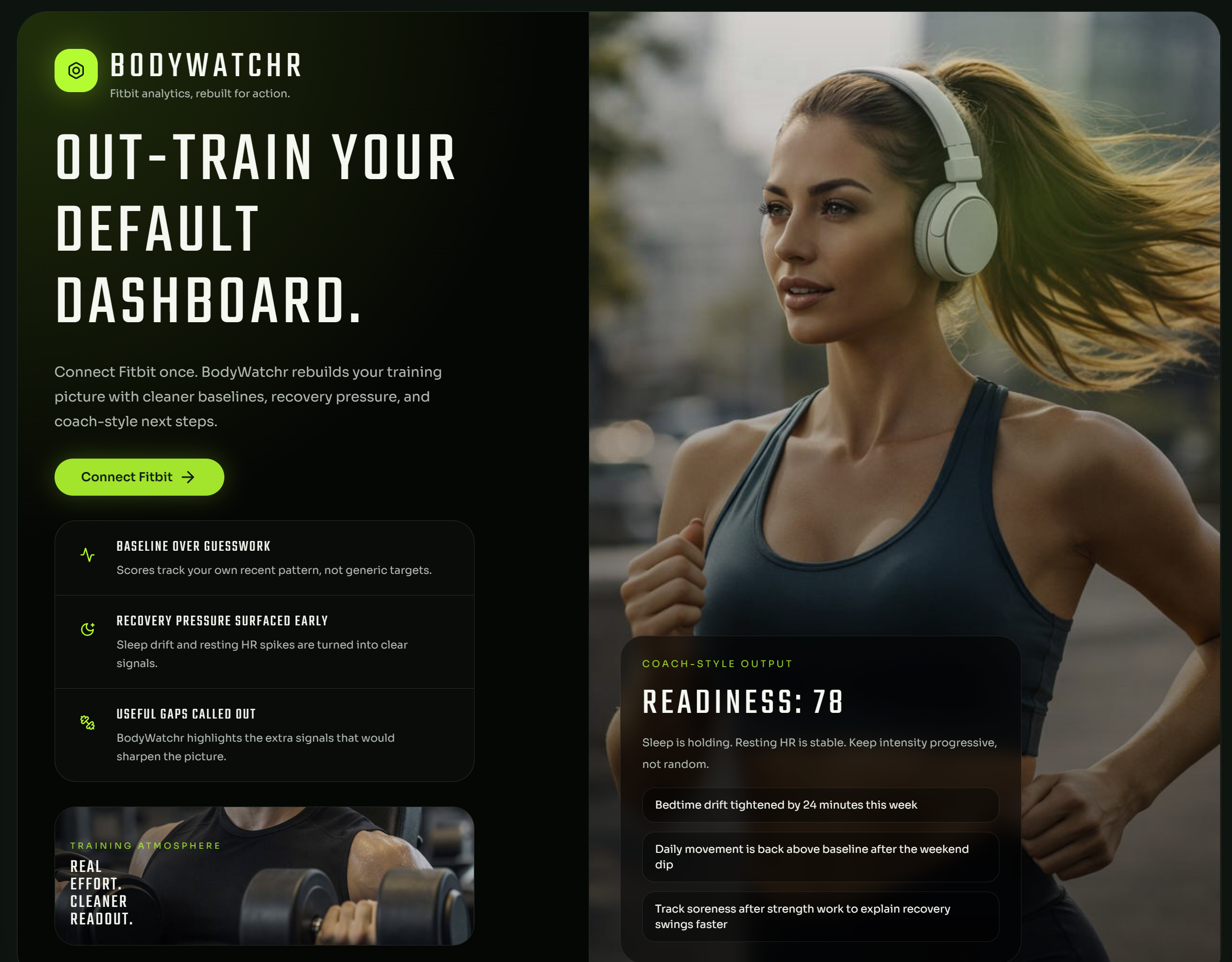
BodyWatchr
A Fitbit analytics product that turns personal health data into dashboards, trends, and plain-English guidance that feels closer to a coach than a spreadsheet.
This project brings together product design, data storytelling, third-party API integration, and full-stack delivery in a single focused experience built to make complex metrics easier to act on.
- React and Vite frontend with a polished dashboard UI
- Express backend handling OAuth, sync, and metric analysis
- AI-assisted summaries layered onto real health trends
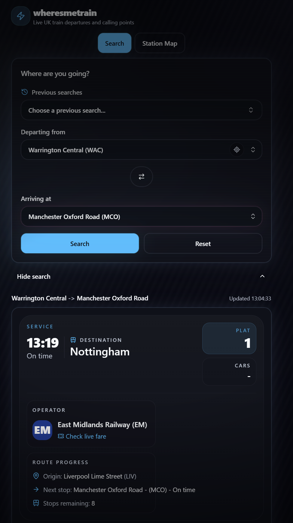
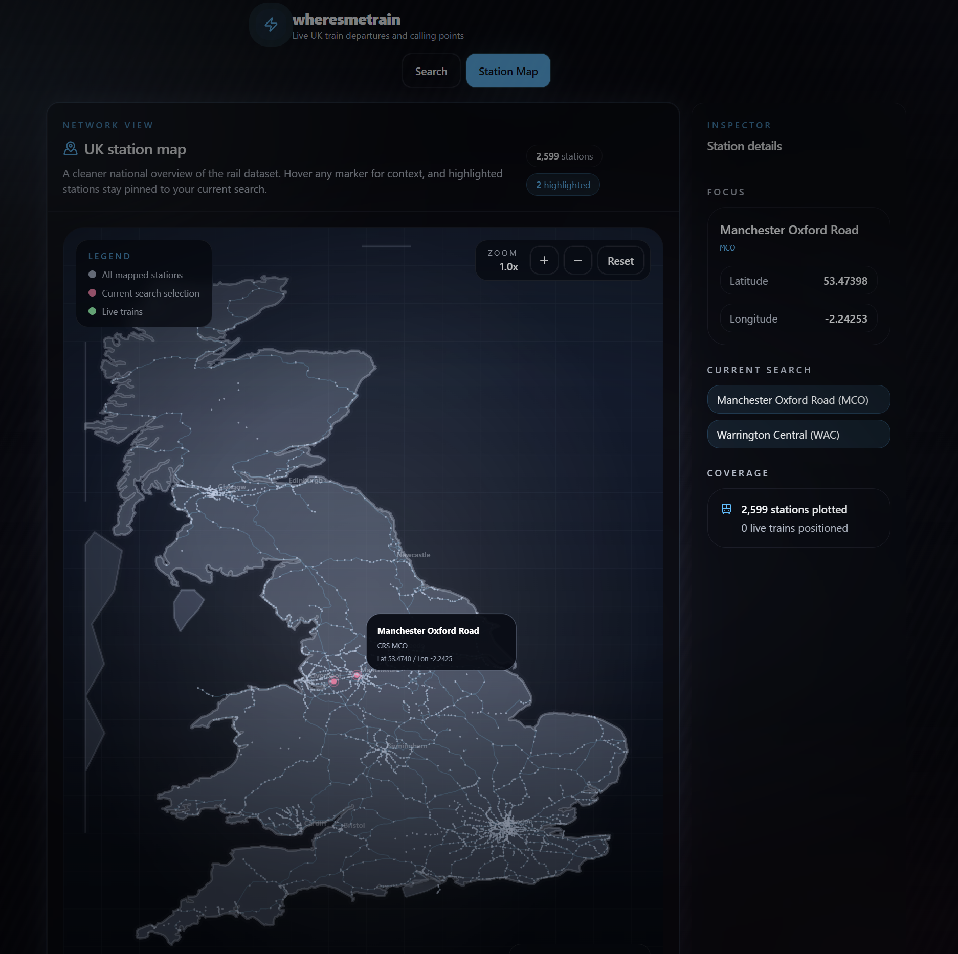
wheresmetrain
A commuter-friendly train site designed to answer the practical question quickly: where is the train, and what does that mean for the journey ahead?
It also serves as a fast product-making case study, showing how an idea can move from prompt-led exploration to a usable public service with a clear, focused interface.
- Built end-to-end through iterative AI-driven product direction
- Structured for rapid journey lookup and decision-making
- Focused on speed, clarity, and commuter utility
Black Tide
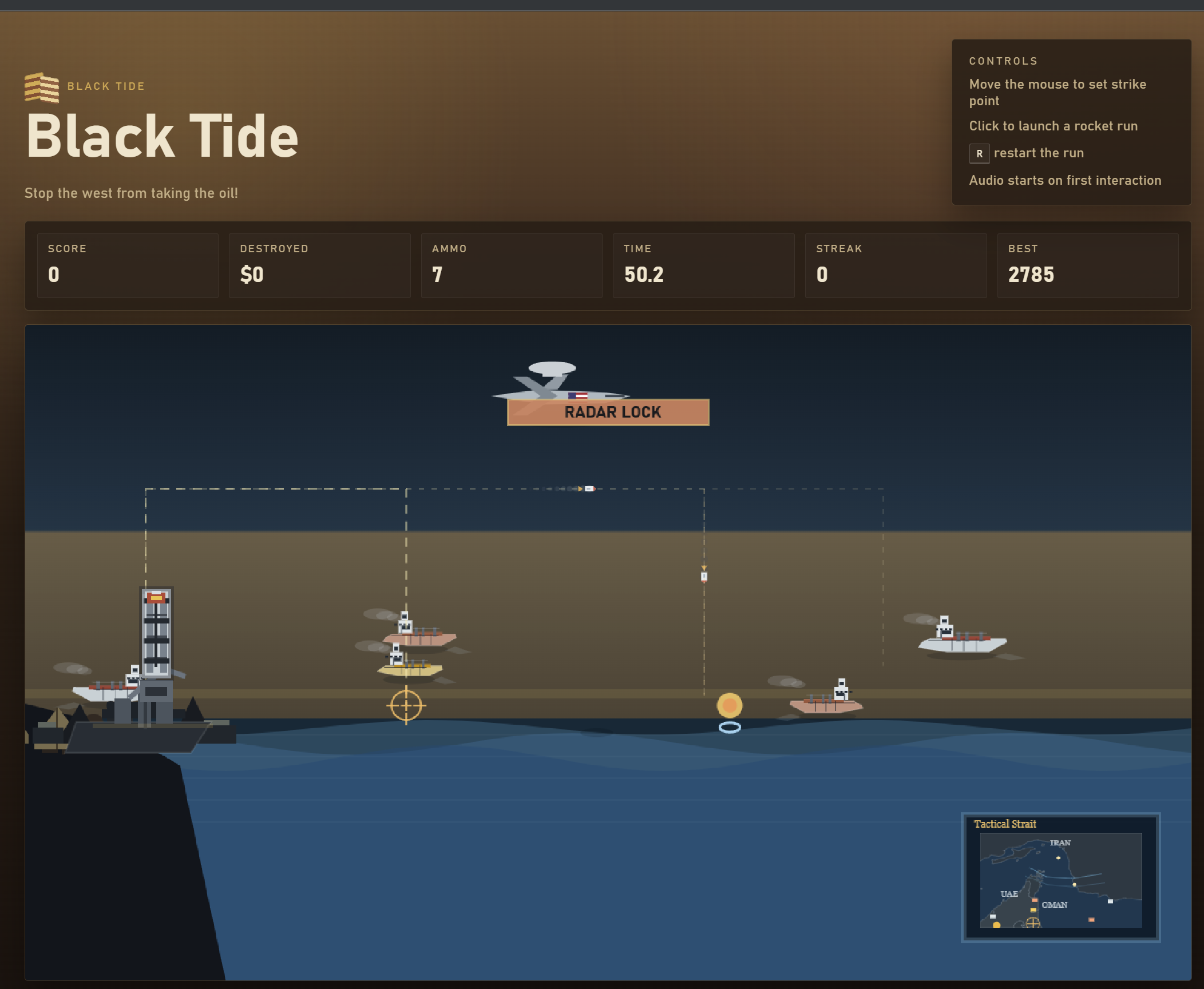
A web game produced through AI-assisted workflows, from concept and interaction design through to the atmosphere, sound, and final playable result.
The project leans into mood and experimentation, showing how generative tools can be directed toward a cohesive experience rather than a loose collection of assets.
- AI-supported ideation, implementation, music, and sound design
- Gameplay delivered directly in the browser
- Built as an experiment in end-to-end creative tooling
Wellness tracker
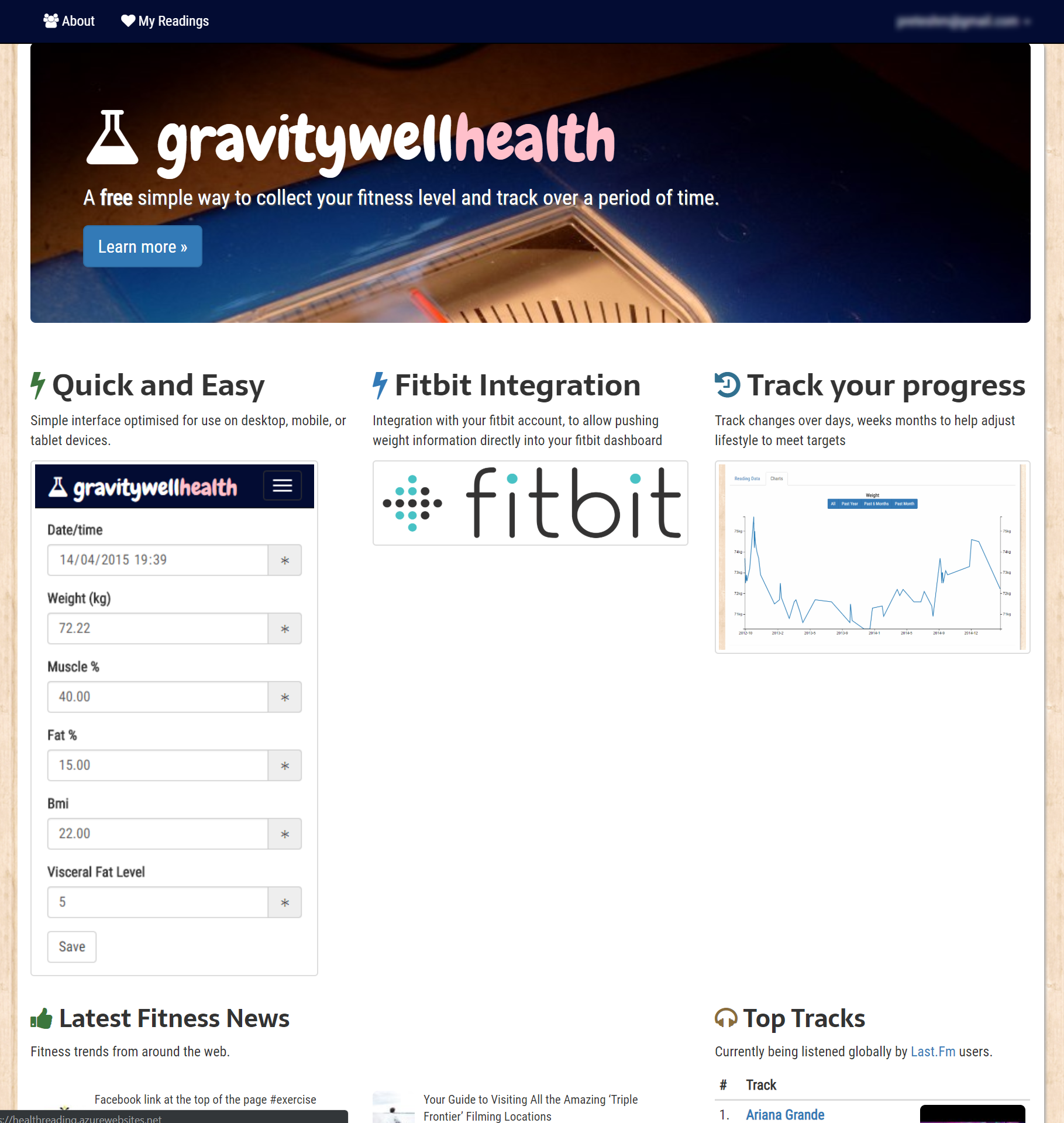
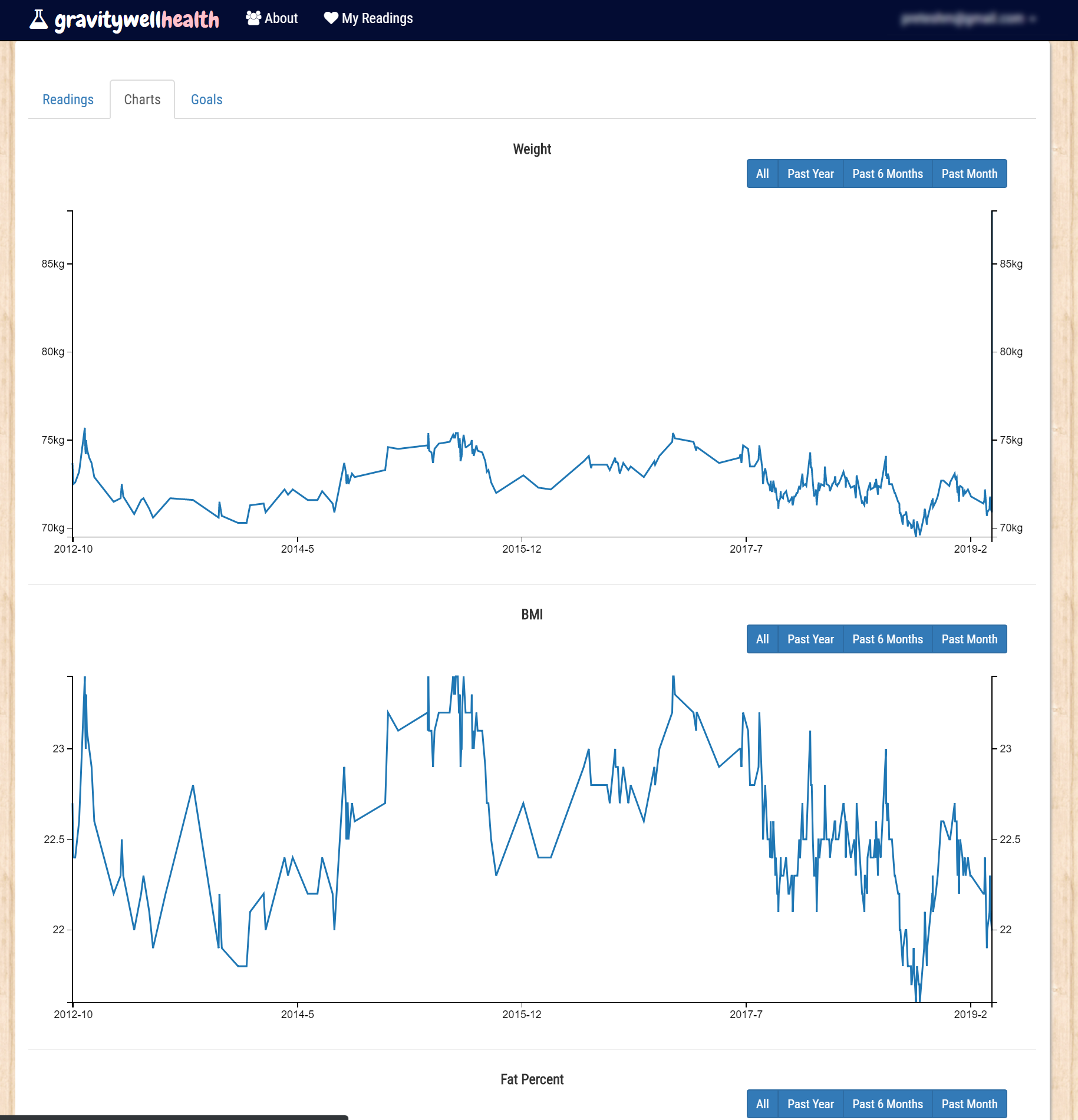
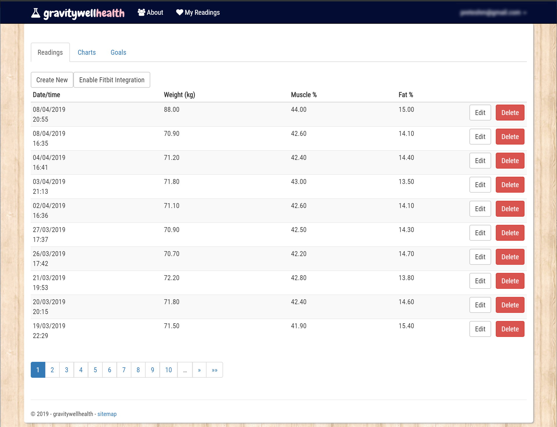
GravityWellHealth
A health companion designed to make habit tracking feel encouraging rather than clinical, with a simple dashboard and clear day-to-day feedback.
The work reflects an early focus on approachable product design: taking routine personal data and shaping it into something lighter, clearer, and easier to return to.
- ASP.NET MVC application with a user-friendly wellness focus
- Dashboard-led experience for habits and progress
- Designed to keep health tracking approachable
Commuter helper
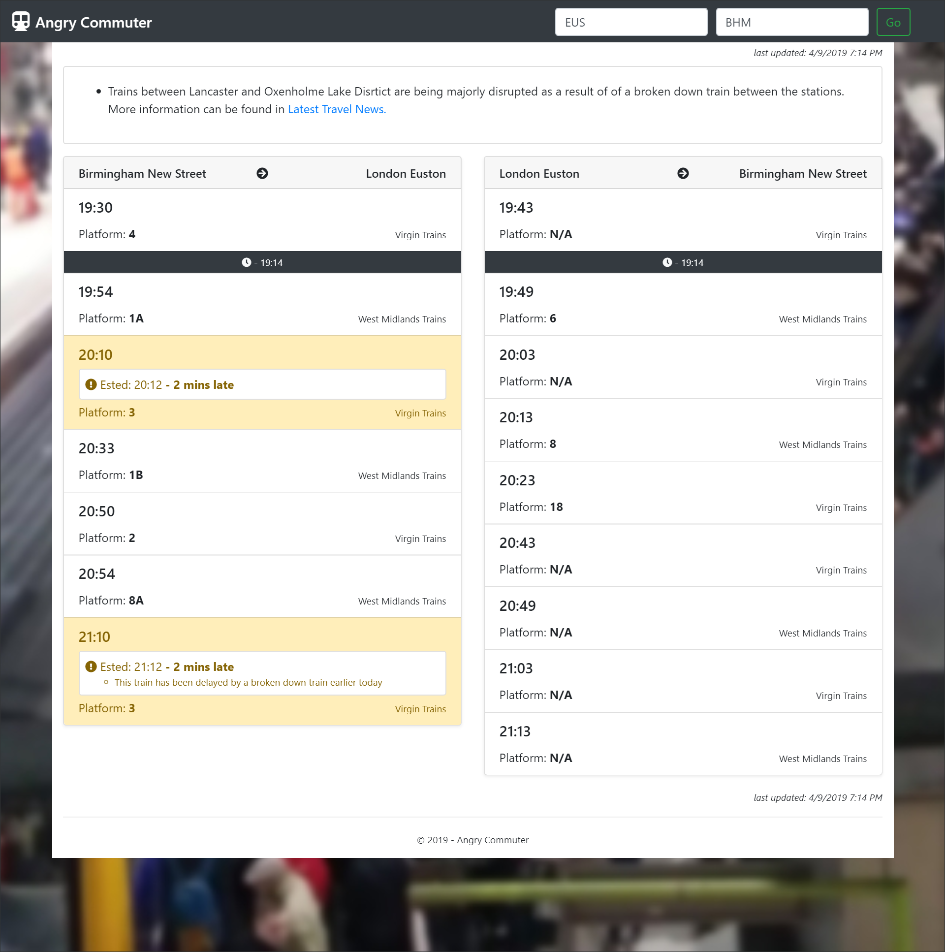
Angry Commuter
A rush-hour utility built for UK rail users who need practical information quickly, including the kind of small details that genuinely improve a stressful trip.
Its strength is direct usefulness: the product stays focused on helping people make better platform and journey decisions without clutter or ceremony.
- Built around commuter pain points and time-sensitive decisions
- Includes practical travel intelligence such as carriage details
- Fast, utility-first interface design
Frontend playground
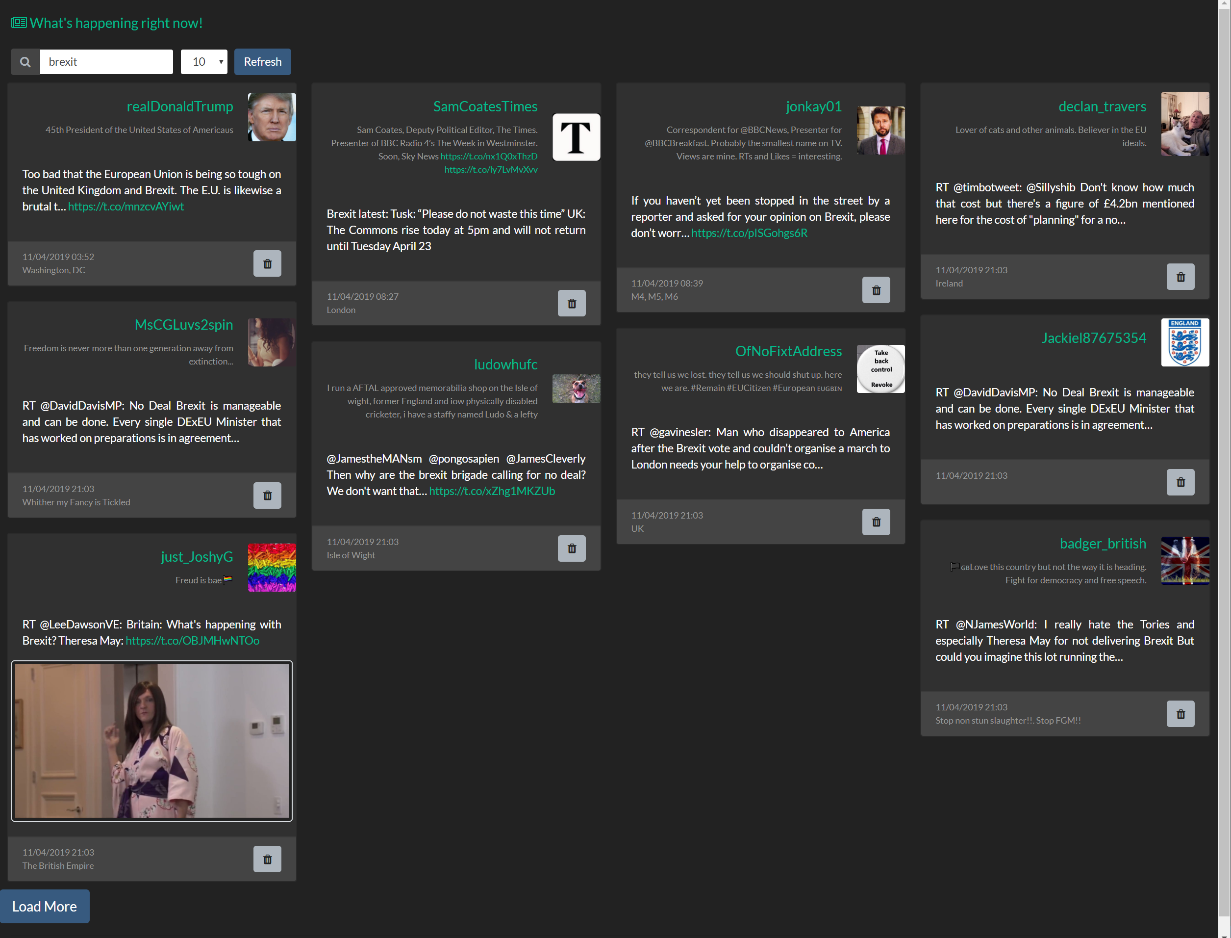
preteshmistry.com
An early AngularJS project that captures the stage where curiosity turned into real momentum: experimenting with interactivity, layout, and the feel of the web as a medium.
It matters less as a polished end product and more as a marker of direction, showing the roots of a long-running interest in expressive interfaces and hands-on making.
- Built during an early exploratory phase of frontend work
- Centered on experimentation and interaction
- Represents the origin point for later product work
Event website
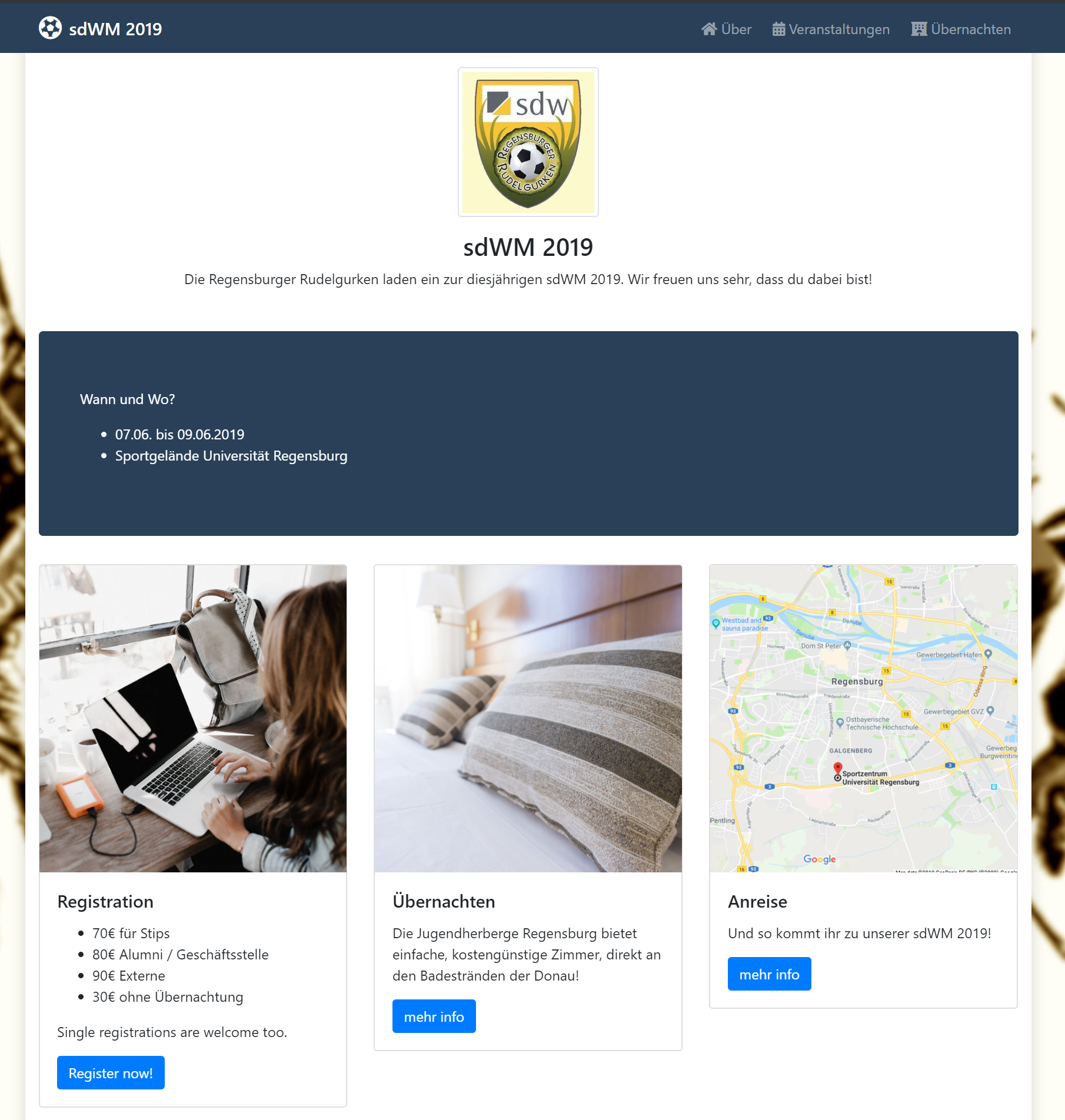
Regensburg University Sports Day 2019
A multilingual Jekyll event site designed to keep information obvious and energy high, helping attendees reach schedules, logistics, and essentials without friction.
This was a good example of structure-led design: a project where clarity, pacing, and usability mattered more than visual excess because the site had to work under real event pressure.
- Jekyll-powered multi-language event experience
- Built for fast access to schedules and key information
- Designed around clarity for live event audiences
Client launch
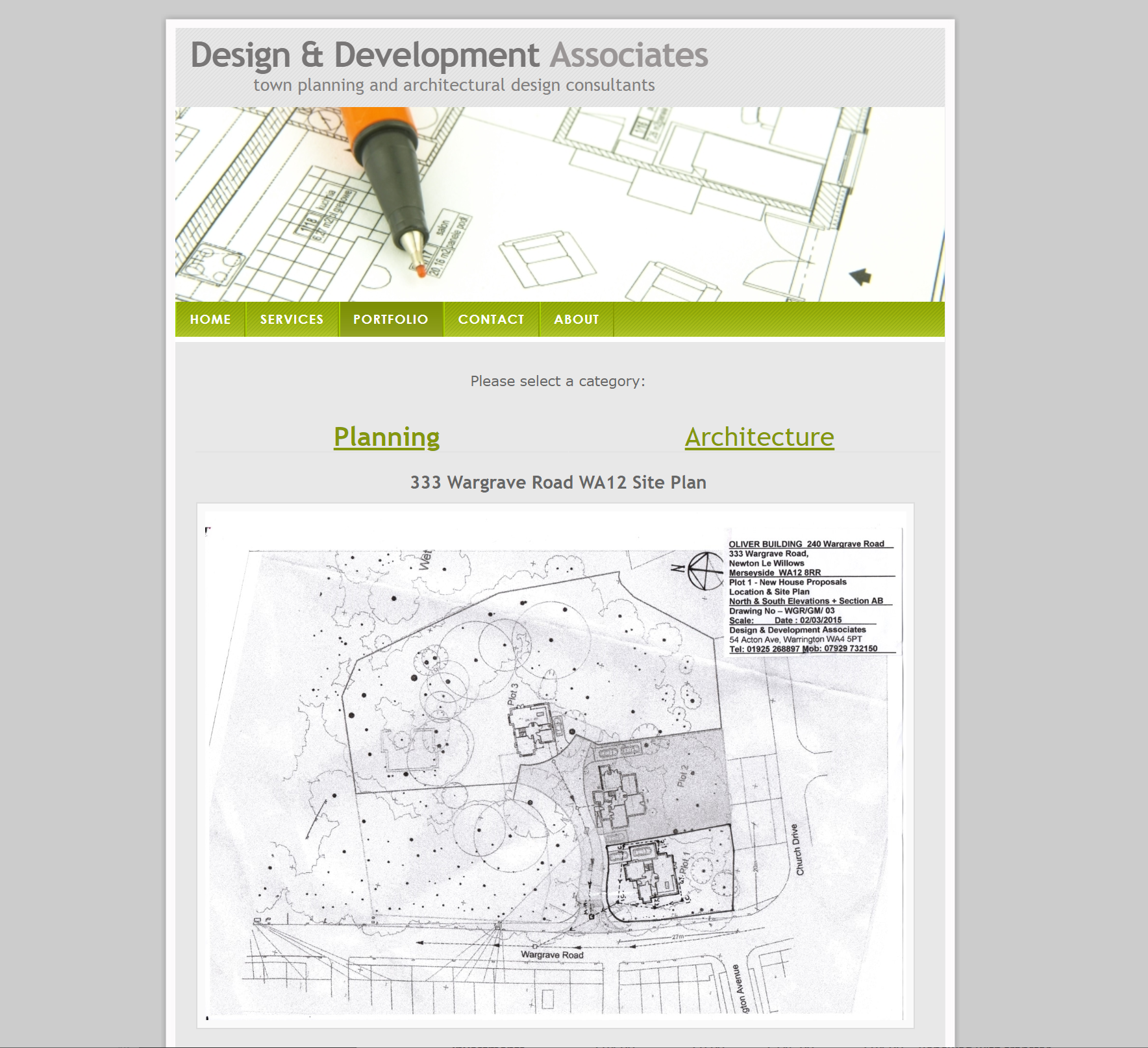
Design & Development Associates
One of my early client-facing launches, created to give an architecture and planning studio a clean, credible digital presence.
The work sits in the portfolio as an important early professional milestone: translating a real client's identity into something clear, polished, and fit for public use.
- Website for an architecture and planning practice
- Focused on trust, clarity, and professional presentation
- Represents an early real-world delivery project